• Devuan project
  • devuan-project
  • Issues
  • #20

Closed
Open
Opened 2015-04-03T03:01Z by hellekin @hellekin

Logo and logotype

Follow-up from ticket #7 (closed) for the logo exclusively. See also issue #21 (closed) for backgrounds and composite images.

devuan-logo

Download

  • PNG
  • SVG

Please solve the reCAPTCHA

We want to be sure it is you, please confirm you are not a robot.

  • hellekin @hellekin mentioned in issue #21 (closed) · 2015-04-02T23:01Z

    mentioned in issue #21 (closed)

  • hellekin @hellekin mentioned in issue #19 (closed) · 2015-04-02T23:37Z

    mentioned in issue #19 (closed)

  • hellekin
    hellekin @hellekin · 2015-04-03T04:54Z

    The four inner planet, the D is the orbit of Ceres. The font is Fira Sans Thin with 15px rounded stroke. The E is based on a U.

    devuan-orbital-swoosh.png
  • hellekin
    hellekin @hellekin · 2015-04-03T04:58Z

    Honestly I much prefer this:

    g7592-4-7-0.png
  • hellekin
    hellekin @hellekin · 2015-04-03T05:05Z

    Another fat variant...

    g7592-4-7-5-7-1.png
  • hellekin
    hellekin @hellekin · 2015-04-03T05:07Z

    Oops wrong file... And I can't remove nor edit the comment!

    g11902.png
  • golinux
    golinux @golinux · 2015-04-04T01:53Z

    Something like this? Or maybe not . . .

    edit - shortened the ends of the 'E' a bit. If the swoosh weren't so bottom heavy it would look better

    Edited 2015-04-04T02:58Z
    swoosh_touch2.jpg
  • hellekin
    hellekin @hellekin · 2015-04-04T11:44Z

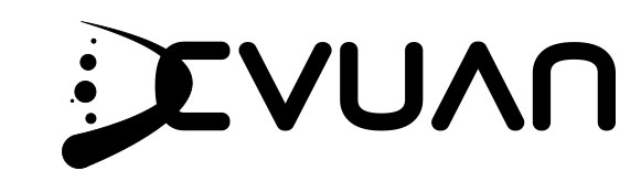
    I think this is the one...

    devuan-swoosh-logotype.png
  • hellekin
    hellekin @hellekin · 2015-04-04T11:46Z

    Or without the planets for comparison...

    path2991-9-8-1-0-7-8-4-4-5.png
  • hellekin
    hellekin @hellekin · 2015-04-04T12:20Z

    Final pass?

    devuan-logotype-tm.png
  • golinux
    golinux @golinux · 2015-04-04T15:56Z

    The'E' is too square and the swoosh is too bottom heavy. Planets are too fussy IMO. Here's a rough transformation:

    Edited 2015-04-04T18:14Z
    finalish.jpg
  • hellekin
    hellekin @hellekin · 2015-04-04T18:44Z

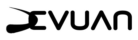
    I tried various things. Not very happy because DE reads more like an X. Maybe the first two lines work best, otherwise I propose sticking to the previous e (last line).

    g7188-4.png
  • golinux
    golinux @golinux · 2015-04-04T19:04Z

    The last one is getting there. But the curve of the 'E' should match the curve of the 'U' and 'N'. The diff is currently disharmonious. And maybe move the swoosh a bit to the left?

    Edited 2015-04-04T19:19Z
    g7188-4tweak.jpg
  • hellekin
    hellekin @hellekin · 2015-04-04T19:19Z

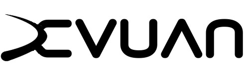
    Ahem, the last one has the same curve as the U and the N. It's just cut a bit short, so it does not show. Meanwhile I gave another pass to the swoosh and the asymetric E.

    path2991-9-8-1-0-7-8-4-4-6-7-1-2-2.png
  • golinux
    golinux @golinux · 2015-04-04T19:20Z

    hellekin: Check post above yours. That new 'E' sucks.

  • hellekin
    hellekin @hellekin · 2015-04-04T19:21Z

    The first line uses the previous swoosh. The second line uses the original swoosh, but is too thin as small scale. The last two lines use something in-between, with the particularity that the "E" part is the same size as other letters.

    So... Back to the previous E?

  • golinux
    golinux @golinux · 2015-04-04T19:27Z

    Only if you move the swoosh to the left a bit.

  • hellekin
    hellekin @hellekin · 2015-04-04T19:30Z

    here you go

    devuan-new-last-next-lol.png
  • hellekin
    hellekin @hellekin · 2015-04-04T19:32Z

    BTW I redrew the E starting from the U and ensured no distortion happened while resizing it. You have a keen eye :)

  • golinux
    golinux @golinux · 2015-04-04T19:35Z

    hellekin: Yes, I do. I have done a lot of art in my life. ;) I think we've got it!

    Someone's coming presently to help in the garden so I'll be away for a while.

    Edited 2015-04-04T19:38Z
  • hellekin
    hellekin @hellekin · 2015-04-04T19:39Z

    \\o/ Me too... Gotta get some food. Letting the issue open just in case someone wants to have us work more (and tip us \xf0\x9f\x91\x8d )

  • hellekin @hellekin Status changed to closed · 2015-04-04T22:03Z

    Status changed to closed

  • hellekin @hellekin mentioned in issue #21 (closed) · 2015-04-05T03:30Z

    mentioned in issue #21 (closed)

  • Jaromil
    Jaromil @jaromil · 2015-04-06T12:57Z

    looking very good and professional. @nextime what do you think?

  • hellekin @hellekin mentioned in commit bb808506 · 2015-04-06T17:26Z

    mentioned in commit bb808506

  • hellekin @hellekin Status changed to reopened · 2015-04-06T17:56Z

    Status changed to reopened

  • hellekin
    hellekin @hellekin · 2015-04-06T17:56Z

    Trying a little thinner, @golinux

    gs4671.png
  • golinux
    golinux @golinux · 2015-04-06T18:21Z

    That's better, I think. Do not like the one posted here #21 (comment 998) Now that the font is thinner, the swoosh could be moved left a smidge.

    Edited 2015-04-06T18:27Z
  • hellekin
    hellekin @hellekin · 2015-04-06T18:29Z

    This:

    g4671.png
  • golinux
    golinux @golinux · 2015-04-06T18:31Z

    @hellekin . . . Nice. One question . . . are the head and tail of the swoosh the same distance from the top and bottom of the 'C'? I can't tell whether it's an optical illusion because the head is thicker but it looks like it hangs down more than the tail goes up.

    Edited 2015-04-06T18:35Z
  • hellekin
    hellekin @hellekin · 2015-04-06T18:32Z

    Here are the two versions for comparison. As soon as you confirm OK, I run outside for some carbon to burn incense, then I update the backgrounds with colors and shapes and stuff.

    both.png
  • golinux
    golinux @golinux · 2015-04-06T18:38Z

    @hellekin I added a question above. Not vital to the choice but I'm curious. I definitely prefer the lighter font. You've done amazing work putting this together.

  • hellekin
    hellekin @hellekin · 2015-04-06T18:46Z

    Yes, the tail is off by an inch... Do you prefer them aligned?

    g4711.png
  • golinux
    golinux @golinux · 2015-04-06T19:12Z

    @hellekin . . . Finally the proportions are balanced!! That you for being so responsive to my nitpicking. But well worth it for the final result. ;) YES! Go with the one above (1007).

  • hellekin @hellekin Status changed to closed · 2015-04-06T20:04Z

    Status changed to closed

  • hellekin @hellekin mentioned in commit 52026187 · 2015-04-06T20:32Z

    mentioned in commit 52026187

  • Franco Lanza
    Franco Lanza @nextime · 2015-04-07T01:41Z

    My opinion isn't so valuable as i understand of graphics about how a bacteria understand about quantum physics, anyway, i like it :)

  • Fred Galusik
    Fred Galusik @fredg · 2015-10-28T19:50Z

    Hi,

    The SVG link is broken. Can you point to a valid one, please ?

    Thank you.

    Edited 2015-10-28T19:50Z
  • hellekin
    hellekin @hellekin · 2015-10-28T21:58Z

    @fredg , nice catch. I corrected the link to point to https://git.devuan.org/devuan-editors/devuan-art/blob/jessie/graphics/logo/devuan-logo.svg