Desktop backgrounds for Jessie
Follow-up from issue #7 (closed) . See also #20 (closed) .
Result available in the repository
Set on a few slogans:
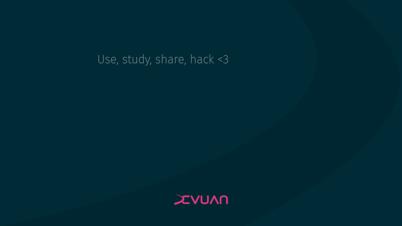
- 4-freedoms : Use, study, share, hack <3
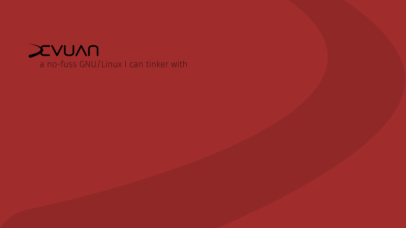
- no-fuss : A no-fuss GNU/Linux that I can tinker with.
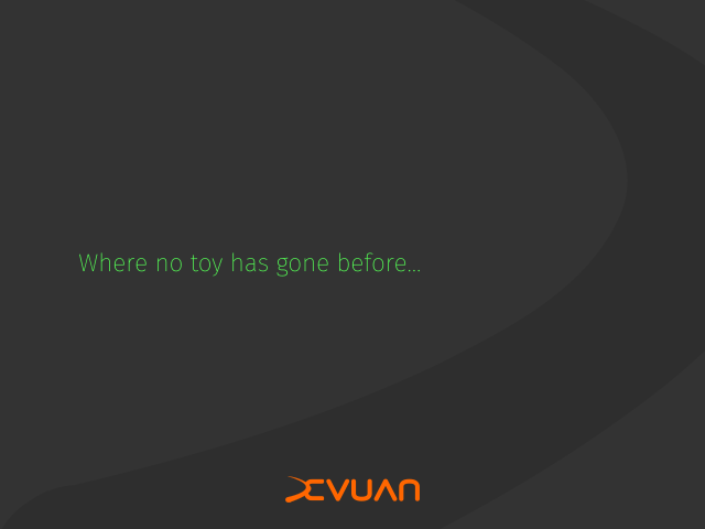
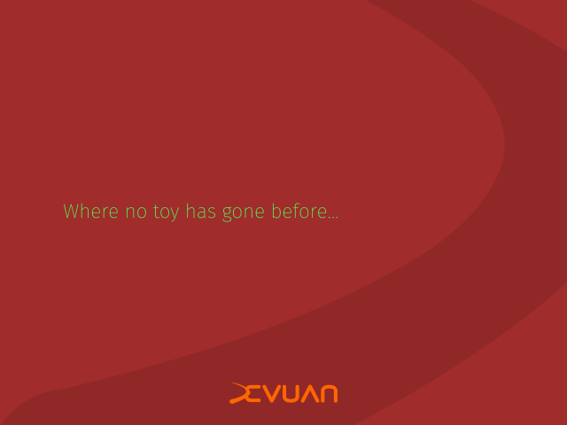
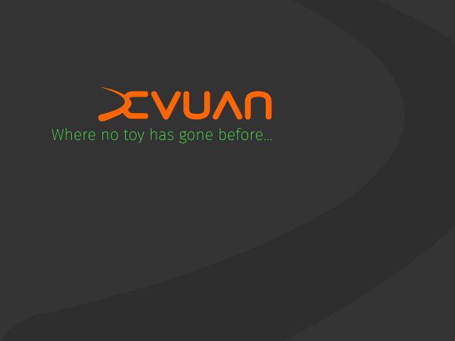
- no-toy : Where no toy has gone before...
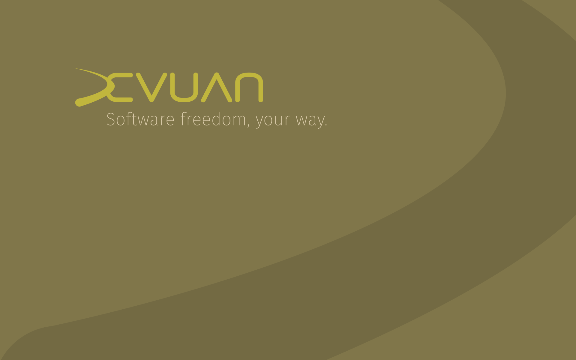
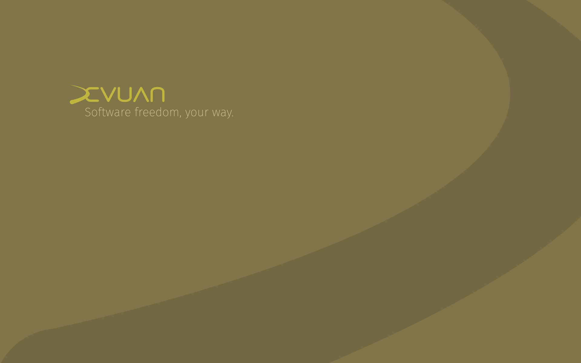
- your-way : Software freedom, your way.
And various colors (see repo)
Pending the logo (issue
#20 (closed)
) for final versions.
-
mentioned in issue #19 (closed)
-

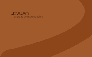
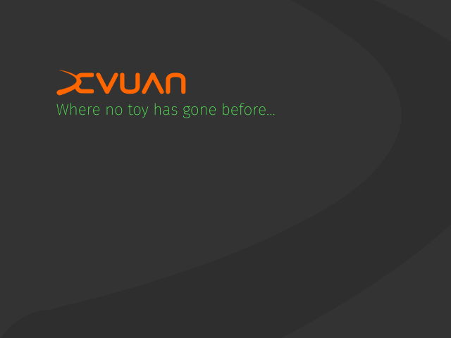
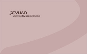
Where no toy has gone before... Red and soft.
-
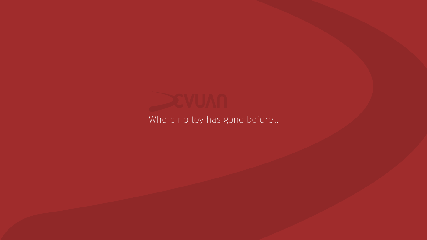
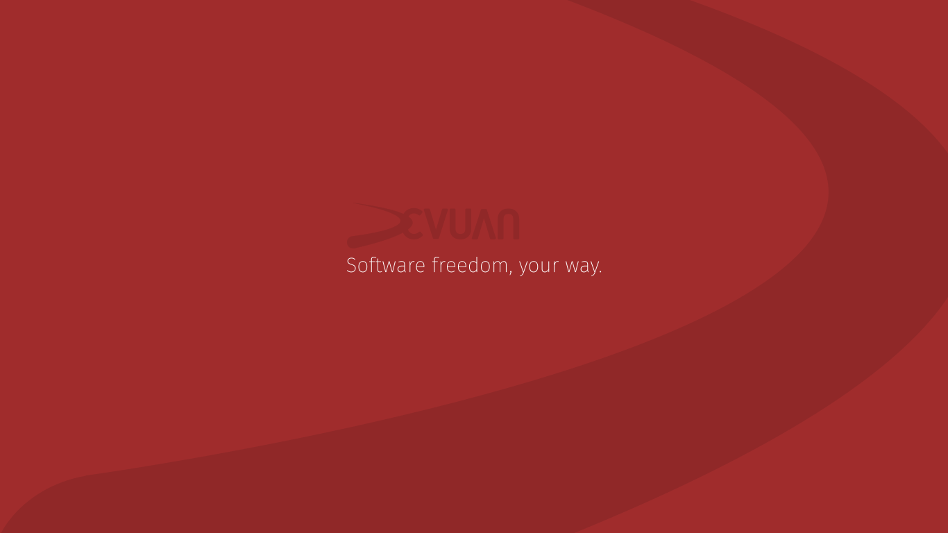
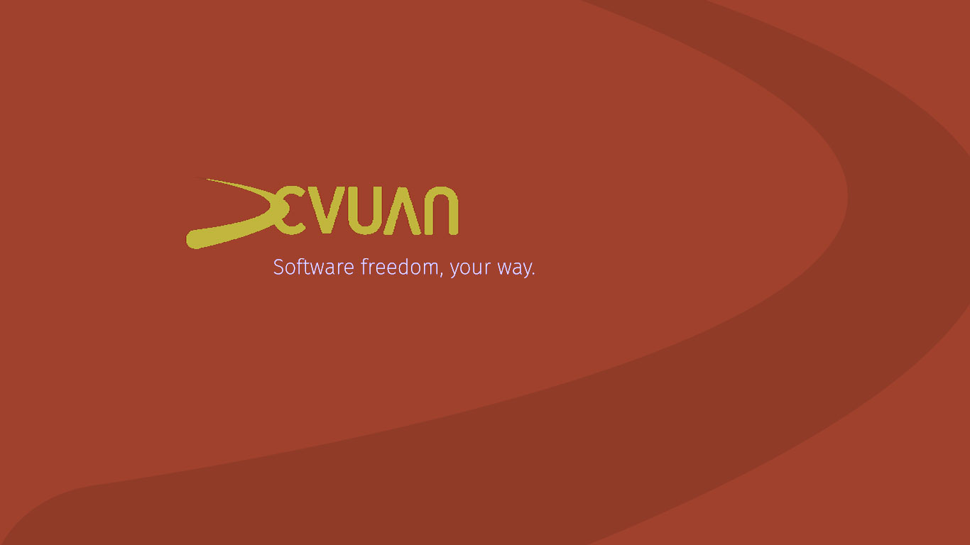
Software freedom, your way. Red and soft.
-
Damn bugs. Not being able to edit is ANNOYING.
-
Well, you see the pattern... Also in dark and light, as the previous batch ...
-
hellekin: Just seeing these. Nice layout with the swoosh. I think the logo could be bigger and have more contrast. Visually it's heavier on the right side. Try compensating by moving the text a bit higher and to the left. That would balance the curve of the swoosh. We need to find a better color for the tag line . . . the white isn't working for me. Red is not to my taste but we can provide alternatives. When I get back on squeeze, I'll play with it a bit. Well done!
PS. I'm not having a problem editing. Doing so just now.
Edited -
Here's a pass with colors and a different layout. Also take into account that it's 640x480, so it's for a small display and should appear quite big.
-
The same in red.
-
I prefer when the logo and the line go together...
-
Hmmm. Better.
-
What I like with a single color is that it does not invade your actual desktop theme. Dark, light, and one dominant color, and that's it. Goes with anything.
-
How about some color?
-
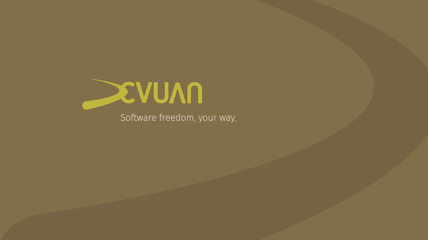
More earthy?
-
Nice... I like both. Here is what I just put on my laptop:
-
You'll notice that I transformed the logo a bit - stretched it out. Gives it more motion. Not so blocky
Edited -
If it floats your boat. :) It's the yin/yang thing again. ;)
Edited -
You do know that those are very rough transformations and would have to be done properly with layers in inkscape.
-
(actually no, it doesn't... Just was testing colors according to the rest of my destop. The colors work, but not the shapes :)
Yes I noticed, but... Really? (comments removed because you've read my mind) I'd rather stick to the logo in #20 (closed) . Every single change is more work for me to adjust every other file.
-
Actually your shape is closer to the original, and better for 16x9 or 16x10 displays... Hmmm...
-
I'm gonna skip it for tonight and watch it again tomorrow.
-
hellekin: The logo started bothering after living with it for a few hours. It's too heavy and blocky. More stretched gives it a lightness and yes, will look better on a wider screen. Also the placement of the tag line starting under the 'E' balances the swoosh in the other direction. I wish I could run inkscape myself but no time to learn right now - garden everyday including tomorrow.
Edited -
What about playing with thickness? That makes it more dynamic.
Otherwise I'm for coming back to the original design with thinner letters and the swoosh apart from the logotype.

-
and it's the wrong issue. Grrrrrrrrrrrrrrrrrrrrrrrrrrrrrrrrrrrrrrrr.
-
hellekin: Oh NOOOOO! Please not a detached swoosh! I was thinking that the letters should be thinner too. Three ideas. 1. a consistent font but thinner. I would try the 'V' thickness first. 2. If you can manage 5 different font weights. have the thinnest font last so it's a gradual progression. 2. Group the font sizes. the swoosh and 'E' heaviest, 'VUA' medium, 'n' lightest. Or 2 + 2 + 2. Are you going to reopen the logotype issue?
Edited -

awesome work hey. I'm testing some graphics in the installer and background for the alpha release. Can you please upload the .svg formats somewhere? I need those. Nothing final, but so we can try look at them in place.
-
@golinux something like this?
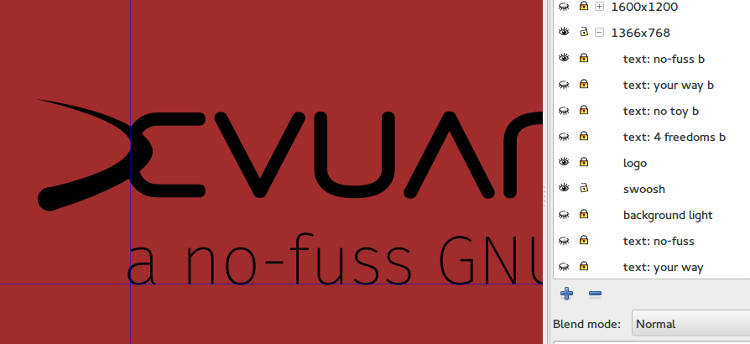
@jaromil I pushed the SVG to the devuan-art jessie branch. It does not include @golinux 's colors nor the ultimate logotype and layout, but you already have lots to play with. In order to export a PNG, you need to:
- Select and unlock the size layer
- "View" the text, logo, swoosh, and background combination
- unlock the background and select the object
- Export PNG - Selection

-
I just realized that the above stepped down the font weight as I suggested. Unfortunately it doesn't work very well. This one is better IMO. #20 (comment 1000)
-
OK, the logo issue is closed, now a bit of layout and colors...
Here's one with your earthy look.

-
Bigger logo
-
I prefer smaller. On a very large display the latter looks very big. Embrace space :)
-
@hellekin Nice. I'm really happy with the logo. I also prefer the smaller type (or maybe something in between) but the placement would be better down and to the right a bit. Thank you for placing the tag line in the little niche under the 'E'. Oh . . . and I'd take off the '.' at the end of the tag line . . . looks funny to me. :) I just got in from mowing for over 3 hours. I'm a sweaty, stinky mess - it was pretty hot today - and not currently on my production machine. After a bath, I'll suggest a placement and it won't be the previous one. ;)
Edited -
Here is the logo repositioned. Only one suggestion. Either the logo needs to be a bit bigger or the tag font a little smaller. Currently the size of the caps is almost identical. I also moved the tag line to under the 'E' on this version. A lower case 'S' in software would help. In fact, I think that probably the easiest place to start.
Edited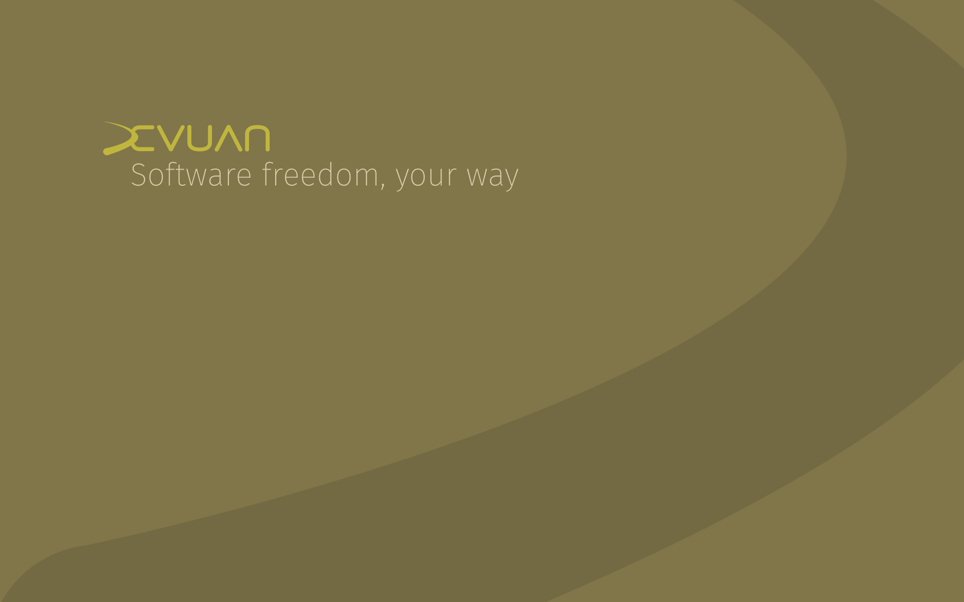
-
I reduced the text size and the logo size as well.
-
Ack. Lowercase, no punctuation.
-
@hellekin Nice colors. I would move the tag line to the right about 2px. Currently the loop of the 'a' is slightly to the left of the edge of the ''E' in devuan so there's a little visual jog there. I would eventually keep all the BG logos in the same position. This one's a little far left, probably because it's longer than the other one. You gonna do a 'toy' one also?
-
I aligned it to the western side of the D. This version is 1366x768, the other one was 1920x1200. I still can move it a bit to the right, it wouldn't do harm. Indeed that one is pretty much on the side.
-
All four will be available in various sizes and all colors. So far we have dark, light, red, and earthy. Here's an illustration of the alignment I've been using.
-
Here's a 'no toy' with a light background.

-
(moved the text a bit to the right.)
-
But the tip of the a is aligned. I'll give it another shot tomorrow. What about green?

-
The u is aligned with the left side of the E (i.e. the interior of the D). Please choose a set of color combinations for background (light and dark) + logo + text. Then tomorrow I fix the alignments and produce the whole series and I'm done with it. We still have to get the site ready.
-
@hellekin Please indulge me by aligning the text from the rightmost curve of the swoosh or the inside of the 'E'. It took me a while to figure out just what was bugging me about the alignment. When it's aligned to the left side of the 'e' it amplifies the left thrust of the swoosh and pulls the eye too strongly to the left. If it's aligned with the tip of the swoosh (or the inside of the 'E') the motion left and right will be more balanced. Will get colors to you by mid-afternoon your time at the latest. Do you have DST in Argentina? Are we 2 or 3 hours difference in the summer? We (mostly you) got a lot done today. The backgrounds look quite elegant in a less-is-more way and the logo rocks!
Edited -
Your word is my command. DST? Ahora no.

-
@hellekin OMG! That is soooo yummy!! And better positioning on the tag. Since it's already done, you could keep the emerald one too. For my color choices I'm thinking dusty purple or the obligatory blue. Maybe both? This is going to be a really nice set with great colors. Question will all colors have all tag line options available so a user can put a tag with the color of their choice? Might be too many MB, I think to do it that way . . . .
What base color are you thinking for the site?
So now there's 2 hours diff between us and 3 hours in the winter?
Edited -
@hellekin OK. Here's a first try at a dusty purple.
light - #7 (closed) B7691
swoosh - #68637B
text - #1 (closed) D1C21
Will take a stab at a blue one in a minute. Food first . . .
Edited
-
Here's a blue one. Had to do a rough reposition of the tag.
light - #97 (closed) A1B0
swoosh - #838D9D
text - #1 (closed) C1E21
Usually I would obsess over this for days. Hope I got it somewhat right first try. Hope you like them.
Edited
-
I find it quite greyish... Anyway I played with it.

-
@hellekin That's fine too. As I said I would usually play with the colors for days but no time on our schedule. I might have eventually come to that myself. Go for it! Just noticed the jessie thing after I downloaded. jessie font size may be a little too big but I like the idea and how it's nestled in the niche above the 'j'. I don't care much for the added line on the inner curve of the swoosh though. It's a bit too fussy and starts to detract.
Edited -
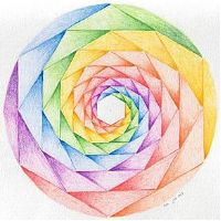
I uploaded the SVG , the master PNGs and the accompanying generation script for all sizes. I guess only some will end up in the
desktop-baserepository. Here is an extra one for people who prefer colors and chaos. It shows the surface of Mercury.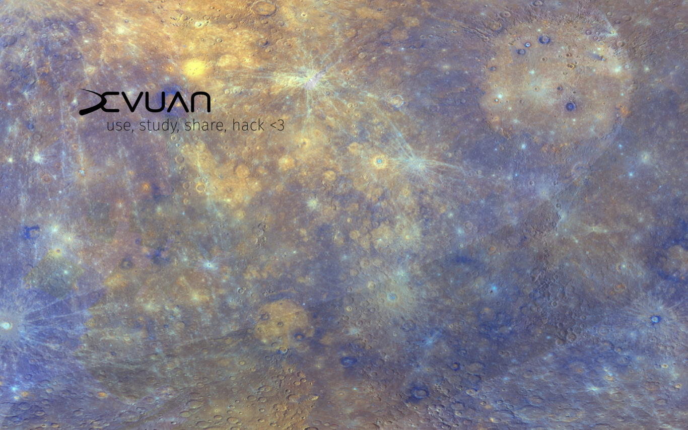
-
Here's 'Icy':
light - #EAF1FC
dark - #DAE6F4
text - #90 (closed) A3B9
Waiting for a re-post of the list that need to be done.
Edited
-
Pinkish or maybe dusky rose
light - #CFB5B4
swoosh - #C6A8A7
 Edited
 -
with black text the pinky one?
List (with current background color):
- earthy (#e9ddaf)
- leafy (#cfb5b4)
- purpy ( #7 (closed) b7691)
- rocky (#e3dbdb)
- rusty (#a05a2c)
- skyish (#d7e3f4, to be replaced with icy)
- nighty ( #40 (closed) b1f)
-
-
Cool. I think we have enough now. Will update the repo...
-
@hellekin - I was wondering if you wanted any more. Thanks for reading my mind. Apologies for being a little slow. So is this the final list? It's a nice 'rainbow' selection!
- dark
- light
- flamy
- leafy
- earthy
- purpy
- bluish
- icy
- pinkish
- rusty
and of course, mercury
I've seen some positive comments about the BGs and logo on irc. I'm happy with them and hope you are too.
Edited -
I only put a sample subset of all color schemes with one text each in the repository. People can make their own combinations from the SVG.
-
Removed in progress label
-
Status changed to closed
-

I like #21 (comment 975) . This layout is good for the installer splash. Grubsplash needs a slightly different layout tho I think.